¶ 1 Leave a comment on paragraph 1 0 Aside from the juvenilia, many of On Kawara’s most famous works are documents of movement and time. For his I Got Up series, Kawara sent two postcards every day between May 10, 1968 and September 17, 1979. Each postcard is stamped with the words “I GOT UP AT” with the time that Kawara got up. In his I Met series, also done during this period, Kawara documented all the people he met. There is a page for each day with a list of each person he encountered. The series I Went, done between June 1, 1968 until September 17, 1979, consists of Kawara tracing with a red line on a photocopy of a map the his daily movements. During the 1970s, Kawara sent telegrams to his friends with the words “I am still alive.” On Kawara, in a canonical history of art, is classified amongst the Conceptualists. If so, he was certainly one of the most meticulous and disciplined. The postcards, telegrams, and lists could be seen as early metadata of a life, one part of the projects of walking, waking, and meeting. Yet he was distinct from his contemporaries in the movement, as Jeffrey Weiss points out, for his devotion to painting.
¶ 2 Leave a comment on paragraph 2 0 For this data project, I would like to focus on his Date Paintings, known collectively as the Today series. It consists of nearly 3,000 works. For the project, Kawara painted according to a strict set of rules. The painting of a given date must be completed by the end of the day or be destroyed. He has eight possible dimensions and three possible colors: red, gray, or blue. There is variety in the colors since they are hand mixed. The date, also the focal point and representative image, is rendered according to the language of the country Kawara was in (he was an avid traveler).
¶ 3 Leave a comment on paragraph 3 0
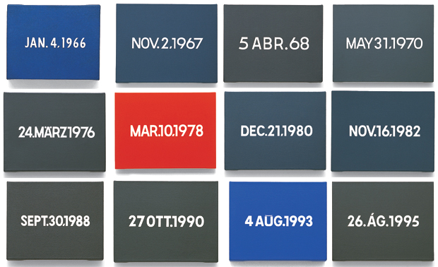
Image of On Kawara’s Time series via Phaidon
¶ 5 Leave a comment on paragraph 5 0 My fantasy is to derive data from all of Kawara’s documented works and establish an interactive database of all his works. The Today series is, in part, a meditation on the day’s events. The craft and care in their painting are astonishing. At the same time, I am approaching this project under the belief that these paintings can facilitate a generative interaction—even when the actual paintings are left out.
¶ 6 Leave a comment on paragraph 6 0 I have attached a csv I made using this checklist from an exhibit of Kawara’s date paintings that was on display at David Zwirner gallery from January 6 to February 11, 2012. I used Excel and made a column for the title of the painting, the month, year, dimensions, city, language of the text, the country, the date, and the caption. I briefly considered using Photoshop to identify the colors of each painting but there are too many variables and adding a column containing that information.
¶ 7 Leave a comment on paragraph 7 0 On Kawara CSV from Zwirner Checklist
¶ 8 Leave a comment on paragraph 8 0 In putting together this csv file, I have already faced several complications and inconsistencies. For some entries in the checklist, the city appears to be in the original language while others are listed in English. I may edit this document to display cities in English without accents. Most cities have identifiable countries, however, based on my Google-ing, Karija (on line 63) may be a city in India or Yemen. I do not know what country Simantogava, the location for 10 FEB. 2006. Then there is the issue of what to do about the captions. After a certain point, Kawara stopped using newspaper headlines as a subtitle and began to simply indicate the day of the week when each painting was rendered. I would like to add to my dataset. I know that he kept meticulous calendars with the dates and colors of his paintings and I am still trying to get access to reproductions of them.
¶ 9 Leave a comment on paragraph 9 0 Moving forward with this dataset, the cleaning of which is proving to be far more complicated and time-consuming that I anticipated, I would like to include latitudes and longitudes for each city. I will definitely be adding a column for a color category (either red, gray, or blue).
¶ 10 Leave a comment on paragraph 10 0 Just to test out my dataset, I have mapped the paintings using CartoDB with years indicated by color .
¶ 11
Leave a comment on paragraph 11 0

¶ 12 Leave a comment on paragraph 12 0 I have also used Google to generate histograms of the paintings by language and dimension included below.
¶ 13
Leave a comment on paragraph 13 0

¶ 14
Leave a comment on paragraph 14 0

¶ 15 Leave a comment on paragraph 15 0 Moving forward, I would like to use R to create subsets of my dataset using color and/or particular years. I can also use it to generate maps with weighted data points, which I might size according to the painting dimensions. Using R would also allow me to examine multiple variables in single visualizations so I would like to represent each date with a weighted datapoint in the color the painting background was rendered in. While my dataset is limited, I am excited to see what patterns in the work can be brought forth through visualizations.
¶ 16 Leave a comment on paragraph 16 0 As I mentioned, part of Kawara’s process involved the construction of a box with a clipping from the day’s newspaper. I don’t know how yet but I would like to somehow incorporate major international events of particular days into this project. It would be great to have headlines from major newspapers for each particular day of my dataset, particularly on the days from the period after Kawara stopped using the headlines as a subtitle. If anybody has suggestions on how I can make this happen, I would love to hear it. Looking forward to your feedback! Thanks!
9 Comments
What a cool idea! I don’t know anything about him except what I learned when I saw his exhibition at the Guggenheim last year, but it seems like a digital, interactive database would be the perfect home for his work. It’s already so… catalog-y (not a technical term) that it just seems to make sense.
Thanks Carolyn! That’s what I’m hoping. My worry is how to make that happen…
Dannabelle, the Today series, in and of itself, offers you quite a lot to work with. It looks like in this initial stage it was challenging to work with some of the data the way that it was entered. I think you can go ahead and talk about those challenges in formatting and how you might need to address that. It would be possible for you to take that column and break it out into 3 different rows. Doing so could really help you to pin point the days that you have and then offers you some potential opportunities to talk about what’s missing–and trying to figure out what’s missing because it was destroyed by the artist or because of something else… Looking forward to next steps!
Thanks for the feedback, Dr. Rhody. I certainly have been some issues and concerns with formatting. I’m still continuing to add to the dataset and consider and reconsider the structure of my dataset. Which column are you referring to that I break up into three different row?
Also, I have been struggling with using R for this project but Chris Alen’s Sula’s Tableau workshop was really helpful!
Dannabelle, I, too, know nothing about the artist. He does seem to be incredibly data driven. My response has to do with the potential larger meaning you hope to derive from your data analysis. What do think it will tell you about the artist and about the world he occupied and traveled through? Have to drawn any inferences or conclusions about him from what you’ve graphed so far? Do we know anything about his personal creative and artistic motivations and inspirations, his drive to produce art in this incredibly meticulous and regimented way? I know this sounds like Old School art criticism but as a historian I’m fascinated with the historical context in which this art was created.
Thanks for the questions, Dr. Brier. Part of my interest in analyzing and visualizing this particular On Kawara series has to do with the fact that he seems to be responding to contemporaneously “current” events in whatever part of the world he happened to be. Kawara described the process of the “Time Series” “everyday meditation” which seems to refer to the repetitive and ritualistic act of painting according to the rules he set forth in the series. Each painting is tied to historical and geographic context. As I mentioned, the paintings were stored in boxes with newspaper clippings published on the same day. I want to see the pattern that emerges-if there is one-between how Kawara painted-keeping in mind the sizes and colors of his canvases-and the events of the day.
I really liked the Guggenheim exhibition and so this project is very exciting to me! Personally I felt that the laborious ritual that the artist undertook, which is apparent when one faces the exhibited series that just goes on and on, has a very meditative quality (to a sublime extent, I might say). This was my initial and only encounter with the artist’s work, and I think a large part of my impression came from the materiality of the work. So naturally I am curious of the different insight that your analysis will bring to this work, as you abstract and modulate the data in various formats.
Your idea of incorporating international events is also very interesting and led me to some Googling. At first I assumed that the DPLA would have a fully digitized newspaper archive; it seems that it is largely an ongoing project, as described in this link: https://dp.la/info/2015/11/09/dpla-announces-knight-grant-to-research-the-potential-integration-of-newspaper-content/
Chronicling America, by the NEH and Library of Congress, and the Europeana Newspapers project that are mentioned in the above link seem interesting, but in the case of the former collection the time range doesn’t fit your project.
So this isn’t much helpful, but I did find something that might be of interest: while poking around the New York Times’ archive (http://query.nytimes.com/search/sitesearch/), I learned that NYT hosts scanned images of every front page on the web. For example, the url for Feb 14 1983 is: http://www.nytimes.com/images/1983/02/14/nytfrontpage/scan.jpg
Change the dates and you get other front pages as well. Unfortunately it is fairly low-res, but it could be something to start with. (Since Jul 6 2012 they also provide higher-res pdf scans: http://www.nytimes.com/images/2012/07/06/nytfrontpage/scan.pdf)
Another thing that popped into mind was Wikidata, that one might be able to search using a given date; their data items have date properties (https://www.wikidata.org/wiki/Wikidata:List_of_properties/Generic), which could be used return events that happened on a certain date. I am however not at all familiar with the Wikidata API so this might be a long shot. Looking forward to how the project goes!
Yes, the Guggenheim exhibition was very haunting and effective, I think in part because of the atmosphere of the architecture itself. And this project kind of does away with the material experience of looking at On Kawara’s work.
I was just playing around with the NY Times front page scans for my chart. Being that I am not as well travelled as Kawara and not as familiar with local news media of a lot of places he visited, I may just for the time of this project/class incorporate the NY Times front page scans. Thanks for the suggestions and feedback!
One Trackback
[…] Steroids USA Buy Steroids USA Buy Steroids USA Buy Steroids USA Buy Steroids USA Buy Steroids USA Buy Steroids USA Buy Steroids USA Buy Steroids USA Buy Steroids USA Buy Steroids USA Buy Steroids USA Buy Steroids […]