Volunteering at DHNow

I completed my volunteer duties at DHNow during the week of December 5th-11th. Since I’m a librarian, I initially planned to dedicate my volunteer week to dh+lib. However, I’ve tried not to restrict myself to library-related issues too much during this course, so I felt it would be more beneficial to volunteer for DHNow and therefore have the opportunity to explore content related to digital humanities at large.

I will discuss my experience in terms of both technical and content issues. First, many thanks to those in the class who previously blogged on volunteering at DHNow or dh+lib. I did not attend the PressForward workshop, so your thoughts on using PressForward for content nomination were greatly helpful in allowing me to know what to expect with this tool. I did experience some minor technical problems in using the PressForward plugin. As others have mentioned, the nomination process is often extremely slow, and I’m not sure how much I would have been able to accomplish as a volunteer without the “Read Original” button. I also noticed that the “Mark as Read” and “Hide” buttons did not always work perfectly well, causing problems with content filtering.

This is going to sound very basic, but while nominating content, I found myself dealing with one of the fundamental questions that we addressed first at the beginning of the course and then throughout the semester: what exactly does digital humanities encompass? As others in the class have touched on, some of the content originating from DHNow’s feeds was not at all related to digital humanities and was easily dismissed, but I came across some borderline cases that were certainly digital but not very humanities-focused. I ended up taking a broad view of the digital humanities tent and nominated a couple of these cases, which were more social sciences-oriented.

Additionally, I was surprised that there was not more content pushed to volunteers from DHNow’s feeds. We were instructed to dedicate one hour per day for nominating content, but I more than once found myself exhausting the content pushed through for that day and having to scour the web beyond DHNow’s feeds in order to nominate content using the Nominate This bookmarklet. I did find the bookmarklet to operate more smoothly than the main PressForward nomination tool.

I wanted to highlight a couple of the resources that I nominated during the course of the week, neither of which I believe made it onto the site. The first of these is the New York Tenements project, which maps and discusses photographs taken by New York’s Tenement House Department in 1934 alongside discussion of photographs taken by Jacob Riis for his photojournalist work How the Other Half Lives. The other resource was a video of a talk on the digitization of cave art in the Magao Caves near Dunhuang, China in a race against deterioration. The initial video I came across is unfortunately no longer available, but the digital exhibit itself can be found here.

Overall, volunteering for DHNow was a good experience, as I was able to both contribute to a great resource and deepen my own knowledge of the digital humanities universe. I’m sure DHNow will continue to tweak their ingest and nomination processes, and I will keep an eye out for new developments with these practices. DHNow allows former editors to nominate content using the bookmarklet, so I may do this going forward as well as try volunteering for dh+lib.

Posted in Uncategorized | Comments closed

Another Perspective on Mapping

This week I have been volunteering to be an editor-at-large for Digital Humanities Now (my post regarding my experience will be coming up in the next few days). I just wanted to take a moment to comment on one piece of news I came across.

The article I am referring to is the following one: 200,000 Years of Staggering Human Population Growth Shown in an Animated Map. This is a map created by the American Museum of Natural History and, in this case, used by senior fellow at Columbia University Andy Stern to illustrate to exponential growth of technology. Overall, the map shows the shift from a relatively short-numbered population until—more or less—100,000 years ago to reaching 170 million people by AD 1. The interactive map also shows the disruptions caused by diseases, famines, plagues and wars until he Middle Ages, as well as a rapid growth in the ensuing centuries.

However, the reason why I brought up this article has nothing to do with its content—no matter how interesting and educational I do find it. In fact, it reminded me of the argument at the beginning of Dan Brown’s novel Inferno. In it, one of the main characters exposes the same reasoning and illustrates the same historical events. This made me think of a connection between GIS and mapping applications and different universes depicted or imagined in written novels.

I remember when we read Franco Moretti’s Graphs, Maps and Trees back in October, there was something that kept me thinking after he focuses on, particularly, epistolary, gothic and historical British novels. What if Moretti’s mapping approach would be applied to science-fiction or fantasy novels? Specially, the ones that rely heavily on location. Later on that month my question was answered by Michelle McSweeney when she showed us—among other projects including her own—The Lord of the Rings Project, created by Emil Johansson. But, aside from that one, there are plenty more novels that could be taken into consideration in order to develop interactive maps of their universe, such as Lewis Carrol’s Alice in Wonderland, C. S. Lewis’ The Chronicles of Narnia or even everything related to King Arthur’s legend and the Matter of Britain. For instance, fans of George R. R. Martin’s Game of Thrones have come up with several open-source interactive maps like the following ones:

· A Song of Ice and Fire Speculative World Map.
· Game of Thrones. Interactive Map.

After these two projects, HBO came up with its own one on the Game of Thrones Viewer’s Guide website.

I honestly believe that applying GIS software to this genre of literature can make the reader gain a better and deeper insight on these themes in particular, and I look forward to studying more interactive maps like the ones I mentioned above.

Posted in Uncategorized | Comments closed

ER Diagrams

With our final papers due within a week, I thought I might make a post about something that could be useful for anyone writing a project proposal. A big part about a lot of digital projects is the database. Representing that in a written format can be difficult, but luckily there is a way! I’m going to do a quick overview of it and give some resources to help you build your own.

In database design, the best way to plan out a relational database is by creating something called an entity-relationship diagram, or ER diagram for short. It’s a simple connected diagram, showing how each table relates to the others. It’s far more useful than a chart or just a list of each table and their columns. Here is an example of one I created for my project proposal. I hosted it on imgur to make it easier to see.

As you can see from mine, there are four different aspects of the database represented there: the main tables, the associative tables, each attribute of the tables, and the relationship. The rectangles are main tables. These should always be separate from each other, with each having a distinct ID. The bubbles around them are the columns or attributes associated with them. The diamonds are how they relate to each other. For example, a teacher can “own” a book. Between these are the associative entities, which are another table that contain references to the main tables. These relations themselves also have attributes, which are usually made up of IDs from the connecting tables. From this, you can see that I have a total of eight tables (four main and four associative).

The lines between the main tables denote the type of relationship. Mine are entirely made up of many-to-many relationships, which are shown by the three-way fork that connects to the associative table. This means that the main tables can have many relations between them. An example of this is how a teacher can own many books and a book can have many owners. Now, you can’t think of them as specific objects; the book is not a specific book, but rather the idea of one. The Hobbit can be owned by multiple teachers because there are multiple copies of it.

It’s tough to explain ER diagrams over a quick blog post, but I hope the idea made it through. The annoying thing about them is that depending on who you ask, they’ll explain different ways of how to make them. I actually learned them in undergrad using a different set of relational arrows than most and it was devoid of associative tables. That was just how my professor taught them. A good resource is this Wikipedia entry and also this step-by-step explanation.

I also made my diagram using ERDPlus. They have a free stand-alone version that allows you to create an image and save an ER file.

I hope this was somewhat helpful. Please feel free to ask me any questions.

Posted in Student Post | Comments closed

CUNY IT Conference

Last Friday I attended the 15th Annual CUNY IT Conference. IT here standing for both Information Technology and Instructional Technology, the conference was a diverse mix of students, faculty- and non-faculty-staff, and businesses. I was there to present on a work in progress, but I did nonetheless get a glimpse (partly documented using #cunyit16) at the ecosystem around education and technology, in a wider perspective than what I am usually exposed to in the scholarly atmosphere in GC.

I presented on my independent study project for the Interactive Technology & Pedagogy certificate program, titled Critical Machine Learning. It is an attempt to build a resource usable by students and researchers to learn about machine learning, both in its technicalities and in a critical perspective about the field’s implication towards people.

slides: http://achimkoh.github.io/assets/cunyitconference16_koh.pdf

Mike Lawrence’s session on Austere Internet Technology Instruction Delivery provided a look into his approach to teaching web development skills at QCC. Mike’s course is based on the flipped classroom model, much dependent of experiential learning happening outside the classroom. His class is divided into groups, each of which working with different sets of web technology (static HTML vs Ruby on Rails, SQL vs NoSQL, …). Mike put an emphasis on the skills’ practicality, embracing open source and proprietary (like Amazon Web Services, for instance) tools alike as long as they are affordable, fall within the criterion of industry best practices, and can be considered resilient in the fast-changing tech landscape. As reflected in his choice of tools that work well in the mobile environment, Mike wanted the tools to be “things that students might eventually use,” unlike Blackboard. His decision of tools was a good refresher to questions such as “why open source,” which I sometimes take for granted (even when it means putting up with inefficiency)—but which should be the subject of critical and practical negotiation.

slides: http://mdlawrence.net/cuny-it

Friday’s keynote speaker was George Otte. His presentation not only reminded me of the importance of a project like the CUNY Academic Commons, but also was informative of the diverse landscape that technologically engaging projects across CUNY made possible. I took some notes but the whole thing was shared online, so I’ll simply link to it. During the Q&A session, one question I found especially relevant was: what role will media literacy play in the next four years?

The gist of the speaker’s answer was that

  • there is huge access, but access is not literacy
  • literacy is our job.
  • literacy is the ability to create, and not just consume.
  • digital literacy is not something achievable with one course, but rather a job for all courses across curriculum

I think this is one way of thinking about the question of whether DH requires coding skills, which we discussed last week (and over the semester).

keynote address and slides: https://purelyreactive.commons.gc.cuny.edu/2016/12/05/cunyfying-uses-of-technology/

Posted in Uncategorized | Tagged , , | Comments closed

Digital Humanities Now: Making Brian Happy Again

As I’m sure many others can empathize with, this election hit me hard. Frankly, it’s scared my socks off and it’s still causing a few sleepless nights. I find myself staring at nothing, with these horrible thoughts running through my head. As a lover of all things political, this is supposed to be an enjoyable time. Hearing policy and watching the democratic system played out in front of me always brings a smile to my face. To me, it doesn’t matter how little of it can get done, if what they’re saying has merit, or even how they look. It’s just cool to see two people duke it out.

My week at DHNow was way back, before the end times, between October 17th and 23rd. Right in the center of that was the third presidential debate. I first got into politics in 2008, and I’ve watched every debate since. It’s not all that far back, but it already seems like ages ago. After two depressing showings this year (and we all know why), I was really questioning whether I would even bother with the third. They were just constantly bringing down my mood.

However, a day or two before the debate, I found this sitting in the middle of the queue. I immediately jumped on it, and even tweeted it out on the class hashtag. I sat for hours just perusing through it, sorting by date and issue. It was fun seeing “young” Bill Clinton, George W. Bush, and Al Gore. After actually seeing it, I have to say that bombshell first question to Dukakis in Let’s Debate ’88 #2 was really uncalled for.

Seeing these old debates and what 2016 is lacking brought my mood up again, so then I ended up watching the third debate this year. It was fun while it lasted.

(P.S. I wrote this before the election and could only return to it now. I had to make a couple edits.)

Posted in Student Post | Comments closed

Course on Distant Reading

Hey all, I am course-shopping, as I imagine some of you are, and came upon a class really relevant to our class. In fact, the description puts a spotlight on Moretti, so I thought I’d share: https://www.gc.cuny.edu/Page-Elements/Academics-Research-Centers-Initiatives/Doctoral-Programs/English/Courses/Spring-2017#Dolan 

Posted in Uncategorized | Comments closed

code, data, around dh in 80 days

whatiscode-javascriptconsole

In addition to the wide-ranging and approachable explanation on the scope of code and software, the persona employed by Paul Ford in the What is Code? article conveys something worth noting: the corporate context that much characterizes the world of software development. And as Ford briefly notes, code/software and data are like the chicken and egg in the planetary computational environment that we are witnessing. Kitchin’s observation that the definition and delimination of data is not independent of the thought system and the instruments underpinning their production holds for code as well.

The abundance of data and its importance in social and personal functioning means that we cannot see data just as representation; it is very much substantial, and performs an ontological role that levels with real objects and the human subject, in a Latourian sense. As Kitchin quotes from Gitelman and Jackson, “if data are somehow subject to us, we are also subject to data.” I think one way to rephrase this is that the locus of human (computational) activity is flesh and data at the same time; different layers of physicality and abstraction operating concurrently. Same goes with code. Code is less something written by a developer that exists separately on a machine, than a channel through which humans perform their activities more and more. Then a bigger urgency is given to observing the context within which such code is created and propagated; corporate culture in the case of Ford’s article.

On a separate but loosely related note, Around DH in 80 Days‘ self-curatorial approach (it is a DH project on DH projects) was interesting and pleasant to follow. The focus on a humanities context and people’s activities around the world seemed like a celebration of the field, and of diversity within it. I tend to think of DH in a Western higher education context, but this project comes across me as an effort to testify that DH is more than a regional trend. There is something here that feels valuable and hopeful.


References

Ford, Paul. “What is code.” Bloomberg Businessweek 11 (2015).
Kitchin, Rob. The data revolution: Big data, open data, data infrastructures and their consequences. Sage, 2014.
Around DH in 80 Days. http://www.arounddh.org/

Posted in Uncategorized | Comments closed

Data Project: Korean tweets with “hashtag I am a feminist”

Introduction

Gender inequality is a persistent condition of the South Korean society. A few numbers might give a rough idea of women’s status in the country:

  • In 2013, women were paid 30% less and were employed 23% less than men. (For comparison, the U.S. gender wage gap in 2013 was about 18%)
  • The most recent legislative election in 2016 resulted in the highest ratio of women in the National Assembly’s history: 17%

Violence against women is also frequent. According to the NGO Korea Women’s Hot Line, at least one woman was murdered by her partner every 4 days in 2015, only counting those reported in the news. The Korean government’s official statistics show that among victims of violent crime, around 30% were women in the 90s; however, this number has increased to more than 80% in the 2010s, pointing to an aggravation of misogynic tendencies of the society.

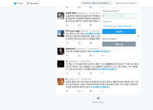
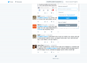
The misogynic tendency of the South Korean society has been the subject of a growing national discussion, one that I have been following online. One important instance in the discussion was the Twitter hashtag #나는페미니스트입니다 (lit. “I am a feminist”), which first appeared on Feb 9 2015.

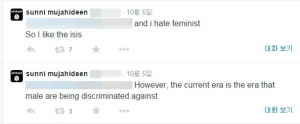
The hashtag appeared after a series of comparison between the Islamic State (IS) and feminism. One South Korean male teenager went on to join IS, after tweeting out “However, the current era is the era that male are being discriminated against” (reflecting a rather common sentiment among Koreans) and “i hate feminist So I like the ISIS.”

image

A male pop columnist then ignited the hashtag, with a magazine article titled “Brainless feminism is more dangerous than IS,” arguing that feminism is confrontational and divisive, which gives rises to such reactions as the aforementioned teenager’s decision.

In response to such an argument, Twitter users started using the #나는페미니스트입니다 tag in order to self-identify as feminist, and also to problematize the negative social construction of the term. I think this movement was an important moment which eventually led to feminist discourse, which I feel was not significantly addressed in mainstream media or in my own social network, take on the role of a more urgent agenda. This is why I was interested in archiving these tweets; looking at the entirety of the tweets, which I experienced in small chunks in real time, might provide a better insight to what happened.

The data

First, I collected the tweets tagged with #나는페미니스트입니다, along with its variants, #나는_페미니스트입니다 and #나는페미니스트다. Since the Twitter API is restrictive when it comes to searching old tweets, I had to rely on Twitter’s web search interface which allows search from the beginning of the service. One thing about this interface is that only a small number of tweets appear at first; in order to see the rest, one has to scroll to the bottom of the page, which then makes the browser load more tweets. Another caveat (which I did not verify, but saw mentioned in several places) is that web browser will stop loading tweets once the number tweets loaded on the page goes above 3,200. In order to reduce the risk of not retrieving all existing tweets because of this caveat, I segmented my search by using the SINCE and UNTIL operators: this allowed me to search day by day, minimizing the tweets that each search will return.

I decided to collect one year’s worth of data using this specific search query. I wrote a Python script using the Selenium WebDriver and BeautifulSoup packages; the script visited Twitter’s web search page using my search query, scrolled down to the bottom of the page, checked if the scrolling down triggered more tweets to appear, then saved the tweets and metadata parsed from the source HTML, iterating over each day.

2015-02-10 2015-02-14 2015-02-13 2015-02-12 2015-02-11 2015-02-15

Over the span of the year, the hashtag was used in roughly 5,000 tweets. It doesn’t seem like a particularly large number, but I think it had the effect of opening up related discourse. I repeated the search over a longer period of time, with the search query “페미니스트 OR 페미니즘” (lit. “feminist OR feminism,” returning tweets that have either terms in it). This search returned nearly 60,000 tweets during the one year after the first use of #나는페미니스트입니다, compared to 33,700 tweets from 2009 (when Twitter started its service) until before the hashtag appeared.

tweets-feminism-or-feminist

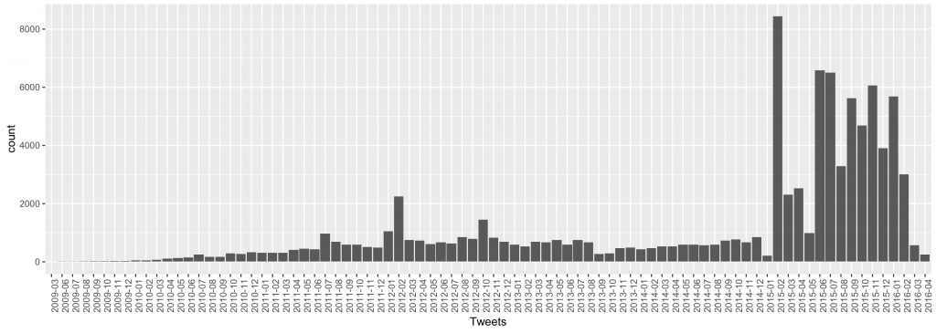
This is evident in the visualization I drew using R, displaying the volume of the tweets per month (total ~90K): there is a dramatic increase of tweets that include “페미니스트” or “페미니즘” in February 2015. For this observation to be more valid I would need to take into account the total volume of tweets written in Korean, regardless of subject, during these periods. However, the drastic change seems to support my hunch.

In addition, I used the unique ids of tweets with hashtags in order to retrieve from the Twitter API a more comprehensive tweet data.

Data files

Tweets with hashtag | Tweets with either ‘feminist’ or ‘feminism’

Analysis

I conducted a basic text analysis of the 5K tweets with #나는페미니스트입니다 and looked at frequently used terms. Using Python’s re and codecs packages, I grabbed the text of each tweet cleaned the data of user handles and weird unicode (which is necessary since I am dealing with a non-Latin language). Then, using the KoNLPy package, which is an NLP tool for the Korean language, I tagged each morpheme with the corresponding part of speech.

A quick list of most common morphemes returns the following list:

common-phonemes common-nouns
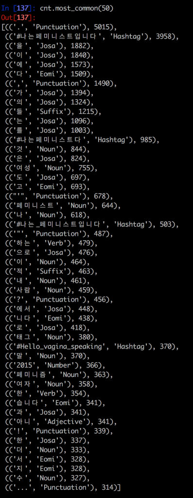
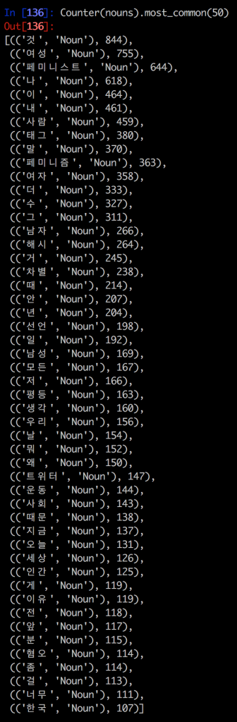
However, there is a lot of unnecessary things here. For starters, hashtags and punctutations; also, the parts of speech ‘Eomi’ and ‘Josa’ exist largely for grammatical purposes—hence the adjacent list of common nouns (written with English translation below)

[((‘것’, ‘Noun’), 844), (Thing)
((‘여성’, ‘Noun’), 755), (Female)
((‘페미니스트’, ‘Noun’), 644), (Feminist)
((‘나’, ‘Noun’), 618), (Me)
((‘이’, ‘Noun’), 464), (This)
((‘내’, ‘Noun’), 461), (My)
((‘사람’, ‘Noun’), 459), (Person)
((‘태그’, ‘Noun’), 380), (Tag)
((‘말’, ‘Noun’), 370), (Word)
((‘페미니즘’, ‘Noun’), 363), (Feminism)
((‘여자’, ‘Noun’), 358), (Woman)
((‘더’, ‘Noun’), 333), (More)
((‘수’, ‘Noun’), 327), (Can)
((‘그’, ‘Noun’), 311), (That)
((‘남자’, ‘Noun’), 266), (Man)
((‘해시’, ‘Noun’), 264), (Hash)
((‘거’, ‘Noun’), 245), (Thing)
((‘차별’, ‘Noun’), 238), (Discrimination)
((‘때’, ‘Noun’), 214), (When)
((‘안’, ‘Noun’), 207), (Not)
((‘년’, ‘Noun’), 204), (Girl- derogatory term, but in this case often an appropriated term like it is the case in ‘slutwalk’)
((‘선언’, ‘Noun’), 198), (Declaration)
((‘일’, ‘Noun’), 192), (Work)
((‘남성’, ‘Noun’), 169), (Male)
((‘모든’, ‘Noun’), 167), (All)
((‘저’, ‘Noun’), 166), (I)
((‘평등’, ‘Noun’), 163), (Equality)
((‘생각’, ‘Noun’), 160), (Thought)
((‘우리’, ‘Noun’), 156), (We)
((‘날’, ‘Noun’), 154), (Me)
((‘뭐’, ‘Noun’), 152), (What)
((‘왜’, ‘Noun’), 150), (Why)
((‘트위터’, ‘Noun’), 147), (Twitter)
((‘운동’, ‘Noun’), 144), (Movement)
((‘사회’, ‘Noun’), 143), (Society)
((‘때문’, ‘Noun’), 138), (Because)
((‘지금’, ‘Noun’), 137), (Now)
((‘오늘’, ‘Noun’), 131), (Today)
((‘세상’, ‘Noun’), 126), (World)
((‘인간’, ‘Noun’), 125), (Human)
((‘게’, ‘Noun’), 119), (What)
((‘이유’, ‘Noun’), 119), (Reason)
((‘전’, ‘Noun’), 118), (Before)
((‘앞’, ‘Noun’), 117), (In front of)
((‘분’, ‘Noun’), 115), (Person)
((‘혐오’, ‘Noun’), 114), (Hate)
((‘좀’, ‘Noun’), 114), (A little)
((‘걸’, ‘Noun’), 113), (That)
((‘너무’, ‘Noun’), 111), (Too much)
((‘한국’, ‘Noun’), 107)] (Korea)

While there are interesting terms such as 차별[discrimination], 선언[declaration], 평등[equality], 운동[movement], and 혐오[hate], this is not yet enough to say something decisive about these tweets. A more detailed analysis would require comparison with other corpora (for example, tweets with other hashtags). I also would like to expand the analysis on the tweets with 페미니스트[feminist] OR 페미니즘[feminism].

Further work: Sentiment Analysis

The methods I employed here provide a basic insight on the quantitative aspect of the hashtag movement. However, the data I used is somewhat incomplete in the sense that it needs to be compared against other, non-topical tweets before I can make qualitative judgements about it. In addition, I would like the analysis to be more sophisticated, if time and resource permit.

My further goal with this project is to conduct a sentiment analysis on the tweets with 페미니스트[feminist] OR 페미니즘[feminism], to see if I can notice a difference in attitude when people are using the terms before and after the hashtag movement. There are a few ways to approach this problem, including sentiment word dictionaries and machine learning techniques. Using a sentiment lexicon is the NLP way; using dictionaries that include sentiment polarities and values for words, one can calculate and determine the overall sentiment of a sentence or a document. This might prove tricky because while Korean sentiment lexicon do exist, for example like the KOSAC, I would still need to write the algorithm to determine the sentiment; this looks like a bit more than I can achieve this term, both in terms of time and in terms of skill. Machine learning methods are diverse, but in many cases it involves training data—pre-determined “ground truths” that the algorithm relies on in order to make decisions. I would have to provide the training data that works in this context as well, which would be a laborious process. I nevertheless hope I can eventually engage in the work, for example by tweaking existing tools.


References

Jang, Hayeon, Munhyong Kim, and Hyopil Shin. “KOSAC: A Full-fledged Korean Sentiment Analysis Corpus.” Sponsors: National Science Council, Executive Yuan, ROC Institute of Linguistics, Academia Sinica NCCU Office of Research and Development (2013): 366.

Eunjeong L. Park, Sungzoon Cho. “KoNLPy: Korean natural language processing in Python”, Proceedings of the 26th Annual Conference on Human & Cognitive Language Technology, Chuncheon, Korea, Oct 2014.

World Economic Forum. Global Gender Gap Report 2015. http://reports.weforum.org/global-gender-gap-report-2015/the-global-gender-gap-index-2015/


Posted in Uncategorized | Tagged , , | Comments closed

Data Project: Ellipses in James Joyce’s Dubliners

Introduction

My data project is, in part, a response to a project over at Joyce Goes Digital, a website from Boston College that seeks to approach the work of Joyce through a “digital” or “digital humanities” lens. The specific project I am responding to focuses on the ellipses that occur throughout James Joyce’s Dubliners. The (unnamed) people who worked on this project came to the conclusion that “Joyce portrayed female characters as simple and flat.” The project in its entirety can be found here: https://bakereo.wordpress.com/2014/05/05/group-work/

There are two reasons I chose to engage with this project. The first reason has more to do with my skill level; in short, I have little first-hand experience with datasets or data analysis, and working from someone else’s data (especially such easily replicable data) allowed me to use this project as a guide of sorts. Because the data was in fact so replicable, I could follow along step by step, which meant that I could learn how to utilize the tools I had never used before in a way that gave me easy goals to strive towards. The second reason is that, as we’ve discussed in class, people who use the same dataset can come to varying conclusions about what exactly the data means (or is saying). And although I think the conclusion that these originators of this project came up with is, in a sense, correct, I ultimately came to a different conclusion, mainly because I decided to expand upon this conclusion through further data analysis.

Data

Like the project before me, I used TextWrangler to find all the sentences in which an ellipsis occurred. There were 150 occurrences (the same number the Joyce Goes Digital got—yay, I’m on the right track!). The complete dataset can be found here, and thankfully, it didn’t require much cleaning up: dubliners_ellipses

The website with the list of characters in Dubliners, which I discuss later on, can be found here: http://www.sparknotes.com/lit/dubliners/characters.html

Preliminary Analysis

To begin, I was also interested in the gender of the characters who either took pauses in their dialogue or were mentioned in proximity to ellipses (the previous project referred to this as “female-centric ellipses” and “male-centric ellipses”). Because I’m (still) not technically knowledgeable, I decided to closely read all of the sentences, taking careful note of whether the subject was a male or female. This was easily doable with a dataset of 150 sentences. I, however, ran into a problem: some sentences didn’t contain a subject of any kind, at least in the sentences TextWrangler had given me. However, this was easily solved by returning to the original text and searching for the individual sentences, which then led me to the paragraphs in which they were imbedded. This allowed me to define a (male or female) subject for every ellipsis. And, like the previous project, I created a pie chart of the percentage of female-centric and male-centric ellipses

dubliners_ellipses

We can definitely see that male-centered ellipses are overrepresented in Dubliners. However, I was curious to see what the total amount of important female characters in Dubliners is, and whether or not the almost complete absence of female-centered ellipses could be explained by the relative absence of important female characters. So I compiled a second dataset, this time of proper names within Dubliners (this time I stole the data from the Sparknotes’ character list for Dubliners), and then I displayed the results on another pie chart:

dubliners_characters

A problem that I ran into was the following: I wasn’t sure how exactly Sparknotes differentiates between “important” and “unimportant characters,” but because this was a relatively small dataset, and there are relatively few characters within Dubliners, I chose to trust Sparknotes. And the results didn’t surprise me: as the pie chart above illustrates, the characters within Dubliners are 31 % female and 69 % male.

What I’ve Learned So Far

I started this project with an answer that was provided to me by someone else, namely that the ellipses present within Dubliners indicate that “Joyce portrayed female characters as simple and flat.” My findings could be seen as either a supplement or refutation of this claim. For example, if we are to take said conclusion as fact, then my analysis of the second dataset (the amount of male and female characters) certainty seems to indicate that Joyce had little interest in female characters, which could then explain their relative “flatness.” However, my findings could also be a refutation of this conclusion, mainly because the amount of ellipses may actually correspond to the amount of female characters, and therefore ellipses aren’t a measure of “flatness” at all, but are instead relative to the amount of female characters.

But the most important thing I learned from this experience was, as I stated before, the ways in which I could analyze data. This is what I think was most essential to my future (perhaps even what will be most essential for my final project).

Posted in Uncategorized | Comments closed

Volunteering as editor for Digital Humanities Now

In September, I attended the PressForward Workshop at CUNY GC, and it helped me a lot during my volunteering week as editor for Digital Humanities Now. The tool is very easy to use, and very powerful to engage with diverse audience. The hard part was to pick the subject: What should I nominate to be published?

Before I start, I read previous editors’ experiences on the blog, and tried to develop my own strategy: First, it should be related to the topics that we have been discussing in our digital humanities class, and second, it should cover current public debates.

Since it was the week after the  election week 2016, the role of digital media during the election campaigns was still a hot topic, and on my first day I nominated Facebook Founder Mark Zuckerberg’s status update on fake news on Facebook. I personally found this discussion quite important especially in the framework of civil rights. We all know that social media is represented as a platform for freedom of speech. Then we have been witnessing deactivation of activists’ Facebook accounts, and now the claim of blocking the spread of particular views in Facebook newsfeeds. Putting everything on “algorithms” has been always an easy solution, but we should request more precise explanation from Facebook. I found just another text worth to nominate on the same day, and it was focusing on the same topic: Did social media elect Donald Trump?

On my second day, discussions on Facebook and their algorithms were still on the table. But I wanted to turn the wheels more towards digital humanities in academia, and I nominated a project from Norway, the visualization of language and identity. The project seeks answers to the following questions:

  • How is literature used to address and express issues of language identity in Norway?
  • How can a digital platform negotiate boundaries and barriers of language use and identity in ways another medium is perhaps limiting?
  • How can we use a digital map or timeline to show flexibility in language use boundaries in ways that acknowledge the complexities of creating boundaries of language use and identity? How are these complexities challenging assertions of homogeneity?
  • How can a digital platform be used to acknowledge perspectives and boundaries, such as those in a cultural, political, or colonial context, while still providing an answer to the question of how literature, through time, has contributed to a Norwegian national identity through language?

Then I stumbled upon an entry on Leonard Cohen, wanted to nominate, but when I checked the link, I saw that it was a reminder post of a library about Cohen’s books, cds, dvds, etc. in their collection. There was not any digital content, so I did not nominate. After having checked all new entries in the dashboard, I decided to nominate a content from outside: Getting started with digital security. Nowadays, especially after the election day, we have been talking about the importance of recording human rights abuses, and sharing them on social media in order to create awareness. Needless to mention, security is the core point, “If you are documenting human rights abuses, technology can put powerful people’s wrongdoings in the spotlight, or it can put you in jail.”

After the third day it got a little bit difficult. It’s hard to find relevant-interesting topic to nominate everyday. At that point, I realized it’s hard to maintain such a blog without a community, and then I totally understood the crucial role of PressForward. But also the importance of having such a digital community. So I’d like to take this opportunity to talk more about PressForward and challenges of creating a digital community, instead of keep mentioning my nominated posts.

Since June 2012, I have been voluntarily working as the digital editor of Museum Professionals Association in Turkey: www.mmkd.org.tr. The main objective is to spread national/international museological news in Turkey, and share professional knowledge. In this regard, we updated our website, redetermined categories, and also launched a blog where members can post their works, and also their interpretations about current issues. The latent goal was to create a museum community in digital. But I have to admit, it didn’t work the way it was aimed. Even each member has their personal account to upload their posts, except a few of them, they keep sending their articles, news links to me. As a volunteer, it is hard to edit all the articles: mainly changing their format into a blogpost since most of them are written as an academic paper; rewriting the news from other sources since we don’t publish copy-paste posts; finding related images because most of the members don’t send image, or just say “I don’t have any”; attributing keywords; and finally publishing it. And one more step, sharing them on social media. Even though I created a manual, and wrote down all the steps with screenshots, members did not want to be part of it. So, today, the blog is there, but it has not been updated since July 2016.

To conclude, at the end of my volunteering week as editor for Digital Humanities Now, I have conceived that digital humanities is  strictly related to digital culture of the society, and it doesn’t happen overnight. So I’ll definitely introduce PressForward to the members of the Association, ask them to add it their browser’s toolbar, and retry to develop a museologist community in digital.

Posted in Uncategorized | Comments closed
  • Archives

  • Welcome to Digital Praxis 2016-2017

    Encouraging students think about the impact advancements in digital technology have on the future of scholarship from the moment they enter the Graduate Center, the Digital Praxis Seminar is a year-long sequence of two three-credit courses that familiarize students with a variety of digital tools and methods through lectures offered by high-profile scholars and technologists, hands-on workshops, and collaborative projects. Students enrolled in the two-course sequence will complete their first year at the GC having been introduced to a broad range of ways to critically evaluate and incorporate digital technologies in their academic research and teaching. In addition, they will have explored a particular area of digital scholarship and/or pedagogy of interest to them, produced a digital project in collaboration with fellow students, and established a digital portfolio that can be used to display their work. The two connected three-credit courses will be offered during the Fall and Spring semesters as MALS classes for master’s students and Interdisciplinary Studies courses for doctoral students.

    The syllabus for the course can be found at cuny.is/dps17.

  • Categories

Skip to toolbar