One Library’s Collection and How Can Call Number Analysis Be of Any Use?

word-cloud

As I’ve been working through the many complications of finding, downloading, cleaning, uploading, and analyzing my data set, I took a moment to create the above word cloud using Wordle which itself was a little complicated as it requires a Java Plugin that is no longer supported on any of the computers I’ve been using today.  After visiting three browsers and two computers to finally have access to adding the plugin (since I cannot easily download or run updates on my work computers due to ITS protocol), I made the above from a list of Subject Headings provided by the Library of Congress.   I actually used a spreadsheet found here.  When working with data, it seems even the simplest of tasks come with many complications!  Regardless, I am not deterred!

The word cloud represents one aspect of what I am trying to look at with my data – a set of call numbers from the McEngegart Hall Library’s Reference Collection at St. Joseph’s College, Brooklyn.  Call numbers have a direct relationship to their subject headings, so I will be using a data set of call numbers and their subject headings which I will use to determine if there is a fair representation of monographs, based on their call numbers and associated subject headings, in the library’s collection for each of the academic programs offered at the College.

Initially, I wanted to look at the entire print collection, but as I began to pull the data, I thought it might be too big (68,794 lines in Excel) of a set (at least for the time being since I plan to use the larger set if I can get the subset to make sense).  So, I’ve chosen to look at the reference collection (1,926 lines in Excel) as a subset, which may offer some insight, but I believe isn’t the best representation of the collection.  First and foremost because of the nature (and cost) of reference collections, my library has stopped adding paper bound titles and relies more heavily on online databases (whose titles are not represented here), so there will be many gaps.  Also, this past summer, we moved several of the reference titles into the circulating collection to give them a better opportunity to be found while students are browsing the collection.  Nonetheless, not an ideal representation, but a start!

Why would I want to know about this aside from having to pick a data set to work with??  Many academic libraries have to defend their need for the large spaces they take up on campus and as many libraries before mine have had to accept, we are losing a quarter of our space to new classroom labs, so I’ve been asked to condense the collection which required hours of measuring and project planning.  For now, I at least do not have to remove any books from the collection (and there’s a little room for growth).  Taking a look at the collection by analyzing the representation of items through their call numbers and subject headings seems to be an interesting way of interpreting the collection in addition to trying to work out the gaps in the collection and see where there may be too much in any particular area.  As I was in the stacks measuring–and I’ve known this for quite some time–there’s a great need for weeding the collection (library speak for removing titles that are superfluous to the collection and do not support the users’ needs).

I know this project won’t change the way library collections are seen on the macro-scale, but it will help define and defend my library’s collection.  I have been asked by two administrators in the last few years if I actually think physical books belong in a modern library.  This is not a question I love being asked as I believe there is still a great need for physical materials, but I think with this project, I can at least counter these inquiries with some impressive data and hopefully some nice visualizations.  It is worth mentioning here that I wanted to start with an open data set available through NYC’s Open Data portal.  I was inspired for this project by a data set listing Brooklyn Public Library’s Collection uploaded to the portal, but I wanted to work with something more directly related to my day to day work (not that I don’t love public libraries and all that they do for this city!).

Pulling the Data:

I thought this would be the very easiest part, and I was right!  With a simple query in an Access Database, I was able to pull call numbers and other bibliographic data that I could export to Excel.  As already mentioned, I planned to use the entirety of the collection as a set, but have since decided to just start with the reference collection subset data.  I came to this decision after grappling with time constraints on cleaning the data.

Cleaning the Data:

I thought this would be a difficult part of the project and I am finding that to be true.  First, LoC Call numbers do not sort very nicely (read: quickly) in Excel as a result of their alphanumeric configurations.  I did find some work arounds and am still experimenting with some of my options.  Another tool I’d like to look into using is OpenRefine.  Second, I also have to remove several of the duplicates due to multiple volumes of one title (or decide if that’s the right thing to do).  I also need to pull and add data on the subject headings that are assigned to each call number.  I am still working out how best to do this: a) do I rerun a query in Access to include assigned subject headings using the MARC records or b) do I work out a way to assign a subject heading based on the call number of the item (the latter could potential be achieved by writing a Python script to assign subject headings based on a call number range).  I still need to experiment with both of these possibilities.

Data Tools to Use:

I intend to first experiment with relational analysis tools listed on DIRT (DIgital Research Tools): http://dirtdirectory.org/tadirah/relational-analysis.  Also, I still have to work out how to draw a correlation between the volume of subject headings represented in the collection to the academic programs.  By taking a look at the programs offered, I will need to determine how these programs can be looked at in terms of subject headings.  Do I develop a list of each program and then determine which subject heading(s) would be of use to this program?  For example, Child Study is a major at the college and one such LoC heading and its corresponding call number range is: “Education — Theory and practice of education — Child study / LB1101-1139” but there are several other headings too.

Conclusions:

So, I still have a lot of work to be done and many more questions to be asked & answered.  I think two complementary projects for this first project would be to look at usage statistics for the titles in the collection.  Once I know what is in the collection and how it represents the programs, I can compare that to what students are actually using.  What are the students searching for in the catalog and what books are they borrowing?  Also an important outgrowth of this initial analysis of paper materials  would be looking at data from the library’s various ebook collection subscriptions, such as title lists from each database and what titles have disappeared over the years of subscribing.  With these additional points of data, an even greater holistic picture could be drawn.  Since Michelle’s presentation on maps a few weeks ago was so thought provoking, I would also like to include some physical representation of the collection using a catalog addition such as LibraryThing’s or StackMap since GPS coordinates wouldn’t work here.

Scope creep is becoming extremely apparent as I wrap up this post and realize that I have talked about a variety of tools I want to work with and tangential data sets that can be looked at and I am starting to feel like I’m overreaching–especially for a project that I do not feel will have some lofty impact on the library world.   However, this data set will change my day to day work world a little and that’s worth it.

Update as of 11/9/16: – I came across this article in my work inbox: http://crl.acrl.org/content/77/6/765.full.pdf+html  I plan to use it as a model to further my own project.
Posted in Uncategorized | Comments closed

Documentation of urban witnessing with media archival data

Over a year, I have been conducting a research on archiving born digital materials, and my main focus is on occupy movements in Istanbul and New York, and autonomous archives. More precisely, I’m conducting a research on video activism, and their archival practices. By leaving the details of my doctoral study aside, I would like to share my (so far) unsuccessful attempt to visualize a media archival data set, and my case study bak.ma
bak.ma is a video collective, an anonymous, autonomous, and open access digital media archive of social movements happening in Turkey. “From Gezi to Tekel workers resistance, 19 January to Hewsel, it aims to reveal the near political history of Turkey with audio-visual recordings, documentation and testimonies.” In other words, it is a way of collecting urban witnesses.
In my visualization project, my principal aim is to present the relationship between space and collective memory through visual testimonies of social movements in Turkey. Since I’m a PhD student in urban studies, I aspire to develop a digital project where one can browse all videos recorded in a city/neighborhood/street, and examine urban temporalities. In this framework, the goal is to set up a map with videos that one can play. Furthermore, the desire is to link videos through particular tags. Hence, one can continue to discover more urban temporalities in other parts of the city/in other cities, and might have the opportunity to conduct comparative analysis.
data set & methodology 
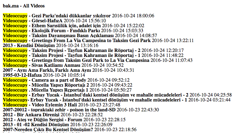
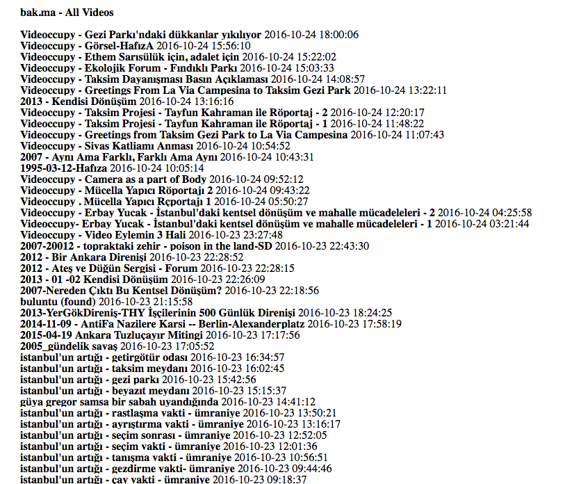
bak.ma is an open to public archive. You can browse images and texts, and play videos without any registration. Signing up/logging in provides you many editorial features, such as uploading, downloading, and editing images, and adding and editing annotations. Indeed, registered users do not have access to get archival data set. Therefore, as a first step of my meta data project, I requested the archival data set from bak.ma via email. Since I know the collective members, it was easy to get in contact, and receive the data set. It is a list of 20 pages in html format, and composed of 1,022 videos. 
foto-1
At first gaze, it was not possible to distinguish the columns/cells in the data set, but it was pretty clear that it has its own logic. In order to discover it, I went back to archive’s website.
foto-2
On the website, it is obviously seen that archive can be arranged in five dimensions: Date, categories, tags, keywords, and time of day.
From the html list I chose videoccupy as a keyword, and started to browse archive with the objective of finding its link in the data set: Is it a category, tag, or user name?
foto-3
foto-4
On the website, there are 29 videos categorized under videoccupy, but the data set listed videoccupy 18 times; 17 lines starting with videoccupy, and 1 mentioned in the video caption. Meanwhile, I found out on the website that the video is categorized under Gezi. So, through videoccupy keyword, I couldn’t find any direct relationship between the data set in my hand and the archive on the website.
foto-5
Then I started to view the archive in different forms with the idea of “catching some relations” through different listings: View as list, as grid, with timeline, with clips, as clips, on map, and on calendar.
When I view the archive as a list, I have seen that there are further available data: Title, date, location, tags, language, and duration. Then I went back to my data set, and did a little research for “language”, and the result was null. It does not exist in there.
foto-7
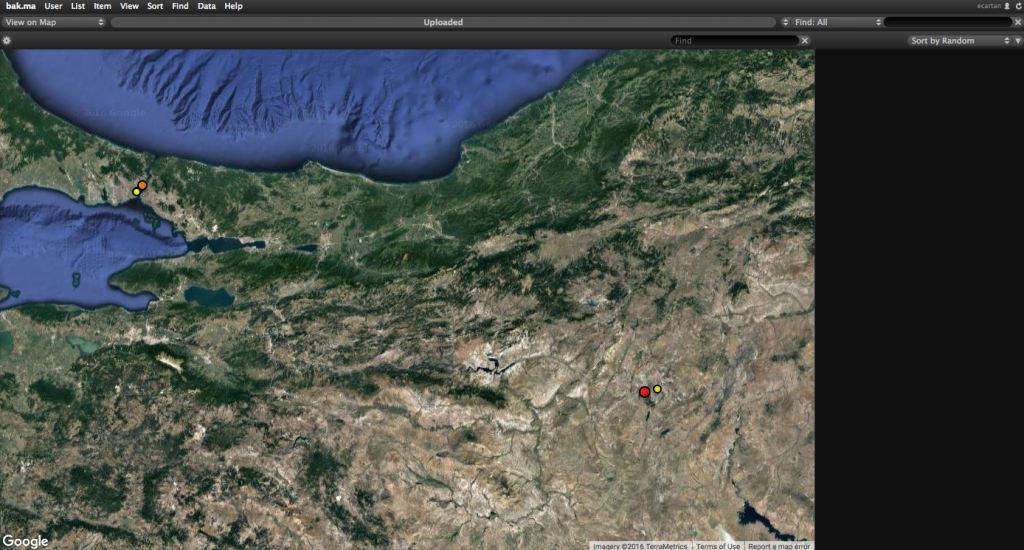
Then I viewed the archive on map, and I came across with a mapping similar to the one in my mind. Indeed, it was not easy to find small dots, as their sizes are directly related to the number of videos recorded in that neighborhood. Especially, finding a few videos coming from the southeastern of Turkey was impossible. And I could not.
As a result, my data set did not work. But meanwhile I discovered what I need to develop a map like the one in my mind: Date, location, and tags. My first plan is to convert the data list in html into xml / csv. I’d probably have to rewrite all data set, because there are two different data sets including the information that I need.
My next question targets to analyze archival practices: The correlation between the date of record and date of upload. I’m aware that bak.ma collects found footages, and upload them regularly. But, what is the frequency of uploading very recent videos of very recent social movements?
Last but not least, I’d be very happy to hear your comments. Since it is partly linked to my doctoral research, any contribution, in terms of research questions and/or tools, will be appreciated.
Posted in Uncategorized | Comments closed

Data Project: (A Selection From) On Kawara’s Time Series

Aside from the juvenilia, many of On Kawara’s most famous works are documents of movement and time. For his I Got Up series, Kawara sent two postcards every day between May 10, 1968 and September 17, 1979. Each postcard is stamped with the words “I GOT UP AT” with the time that Kawara got up. In his I Met series, also done during this period, Kawara documented all the people he met. There is a page for each day with a list of each person he encountered. The series I Went, done between June 1, 1968 until September 17, 1979, consists of Kawara tracing with a red line on a photocopy of a map the his daily movements. During the 1970s, Kawara sent telegrams to his friends with the words “I am still alive.” On Kawara, in a canonical history of art, is classified amongst the Conceptualists. If so, he was certainly one of the most meticulous and disciplined. The postcards, telegrams, and lists could be seen as early metadata of a life, one part of the projects of walking, waking, and meeting. Yet he was distinct from his contemporaries in the movement, as Jeffrey Weiss points out, for his devotion to painting.

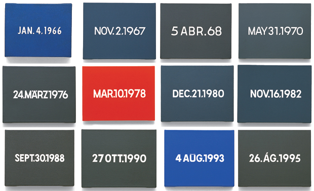
For this data project, I would like to focus on his Date Paintings, known collectively as the Today series. It consists of nearly 3,000 works. For the project, Kawara painted according to a strict set of rules. The painting of a given date must be completed by the end of the day or be destroyed. He has eight possible dimensions and three possible colors: red, gray, or blue. There is variety in the colors since they are hand mixed. The date, also the focal point and representative image, is rendered according to the language of the country Kawara was in (he was an avid traveler).


Image of On Kawara's Time series via Phaidon

Image of On Kawara’s Time series via Phaidon

My fantasy is to derive data from all of Kawara’s documented works and establish an interactive database of all his works. The Today series is, in part, a meditation on the day’s events. The craft and care in their painting are astonishing. At the same time, I am approaching this project under the belief that these paintings can facilitate a generative interaction—even when the actual paintings are left out.

I have attached a csv I made using this checklist from an exhibit of Kawara’s date paintings that was on display at David Zwirner gallery from January 6 to February 11, 2012. I used Excel and made a column for the title of the painting, the month, year, dimensions, city, language of the text, the country, the date, and the caption. I briefly considered using Photoshop to identify the colors of each painting but there are too many variables and adding a column containing that information.

On Kawara CSV from Zwirner Checklist

In putting together this csv file, I have already faced several complications and inconsistencies. For some entries in the checklist, the city appears to be in the original language while others are listed in English. I may edit this document to display cities in English without accents. Most cities have identifiable countries, however, based on my Google-ing, Karija (on line 63) may be a city in India or Yemen. I do not know what country Simantogava, the location for 10 FEB. 2006. Then there is the issue of what to do about the captions. After a certain point, Kawara stopped using newspaper headlines as a subtitle and began to simply indicate the day of the week when each painting was rendered. I would like to add to my dataset. I know that he kept meticulous calendars with the dates and colors of his paintings and I am still trying to get access to reproductions of them.

Moving forward with this dataset, the cleaning of which is proving to be far more complicated and time-consuming that I anticipated, I would like to include latitudes and longitudes for each city. I will definitely be adding a column for a color category (either red, gray, or blue).

Just to test out my dataset, I have mapped the paintings using CartoDB with years indicated by color .

I have also used Google to generate histograms of the paintings by language and dimension included below.

Moving forward, I would like to use R to create subsets of my dataset using color and/or particular years. I can also use it to generate maps with weighted data points, which I might size according to the painting dimensions. Using R would also allow me to examine multiple variables in single visualizations so I would like to represent each date with a weighted datapoint in the color the painting background was rendered in. While my dataset is limited, I am excited to see what patterns in the work can be brought forth through visualizations.

As I mentioned, part of Kawara’s process involved the construction of a box with a clipping from the day’s newspaper. I don’t know how yet but I would like to somehow incorporate major international events of particular days into this project. It would be great to have headlines from major newspapers for each particular day of my dataset, particularly on the days from the period after Kawara stopped using the headlines as a subtitle. If anybody has suggestions on how I can make this happen, I would love to hear it. Looking forward to your feedback! Thanks!

Posted in Uncategorized | Comments closed

Data Project: The Fragments of Virginia Woolf’s Between the Acts

Read more about my data project on its GitHub project overview page.

Source: Data Project: The Fragments of Virginia Woolf’s <em>Between the Acts</em>

Posted in Student Post, Uncategorized | Tagged | Comments closed

DH Praxis Data Project: Building a Finnegans Wake dataset

Who knew that Finnegans Wake would one day be reduced to cells in a spreadsheet?

For a long time, I wanted to do experiments with Finnegans Wake and data visualizations. This recent assignment gave me this chance so I quickly started to try to think about it. The first thing I had to do was figure out my dataset. Obviously Finnegans Wake is fiction and relies heavily on an idioglossia of Joyce’s design so it might be tough to pinpoint distinct data points for the book. This meant that I had to take a step back and look at the book from a very removed perspective to start -what better a dataset for this book than its own lexicon and frequencies? Studying the Wake in the past led me to remember a couple of different online tools like Fweet, which is a search engine for the book, and Finwake which is an online annotated version. However, the most useful gathered data would have to be from Eric Rosenbloom’s Concordance of Finnegans Wake which he compiled apparently in the late 1990s. Throughout this project, there will definitely be certain data constraints considering the fact that no major datasets have really been constructed for the Wake.

To continue reading, please visit my blog HERE.

Posted in Uncategorized | Comments closed

DH school data project data set | Lower East Side Librarian

Zine Content Comparison

Introduction

As the curator and cataloger of a zine library with holdings going back to the early 1990s I am sometimes asked to comment on how zines have changed over time. I read and catalog zines out of time, as they rise to the top of the processing queue, which makes it hard to respond to that question with confidence, though I have my theories. My suspicion is that zine creators in the 1990s wrote more about sexual assault and critiqued capitalist systems of oppression more than their 2010s counterparts, who are more likely to write about mental health and friendship. My informed assumptions extend to the visual elements of the works, with 1990s creators working primarily, even exclusively, in black and white photocopies with photographs, reproduced zine ads, hand drawings, and riot grrrl fliers, as opposed to more sophisticated reprography, desktop publishing (InDesign, rather than Publisher or analog cut and paste).


A sampling of covers of zines by high school and college students from the 1990s and the 2010s

To keep reading, go to: DH school data project data set | Lower East Side Librarian

Posted in PressForward, Student Post, Uncategorized | Tagged , | Comments closed

How to Access Subway Data

Last week, we talked about data pertaining to the subway in class and I brought up that I work for New York City Transit myself. I’ve been meaning to write a short blog post about how to access the MTA API. A good amount of free data is available, including the actual arrival times for the 1-6 trains in real time.

You can access everything here. You just need to agree to the terms and check out what they have. From there, just follow the instructions to get a key and read the documentation for how to use it.

The backbone of everything is the static GTFS (General Transit Feed Specification) file. This is an industry-wide standard which details subway station information, scheduled train arrivals, trips, transfers, the actual genuine shape of the route a subway line will take on a map (as close to accurate as it can be), and more. This is what Google uses to display all of its transit data, while also including real-time feeds where it exists.

Let me know if you have any questions and I’ll do my best to answer them.

Posted in Student Post | Comments closed

Data Visualization with Micki Kaufman

First off, let me say that this was not a tutorial. I followed along on some of work Micki Kaufman did in Tableau and Gephi, but this session was not meant to be a tutorial. Instead, we learned from Micki’s tremendous experience the practices that make effective, scholarly presentations of data. I will highlight some of the things I learned and insights I had.

Micki spent some time on color acuity, which is obviously very important when using color to represent data. Apparently red and green make for an awful pair, and Excel often defaults to a red and blue that some may struggle with. The best pair to use is blue and yellow, as most people can distinguish it. When possible, using different textures and lines can also be very helpful.

Micki emphasized that we do not have to be experts in computer science to use advanced data-manipulation techniques and feel confident in our work. For one thing, she railed on “brogramming,” the idea that one needs to use command line to achieve anything. Instead, it is probably better to use GUIs that have been created for more general use. I do feel that with most software, limitations will eventually surface as you get really specific in what you need to do. Relatedly, one only needs to know so much of the backend and underlying principles to confidently make their argument. This reminded me of some of our early readings in Debates in the Digital Humanities, and I think some scholars may disagree with the adequacy of our tools.  Micki instead highlighted visual subjectivity and the need to be aware of how a visualization exaggerates or de-emphasizes phenomena.

For instance, a word cloud represents how often words are used in a dataset, but their proximity is entirely random, and this can have unintended consequences. Micki’s work obviously goes far beyond just measuring the magnitude of words. She demonstrated some of the techniques she has applied and experimented with, such as topic modelling, collocations, and concordance.

Some of Micki’s other points related strongly to our class discussions–her use of monochrome in one visualization because of severity of death her topic touches, The History Manifesto, and the hermeneutic, cyclical process of visualization. Perhaps the most poignant thing Micki said was that a groundbreaking analysis or visualization must at once be dramatically different and similar to what the observer expects. Replicating past arguments is hardly compelling, nor is finding data that supports a completely bewildering idea. Instead, there must a contextualized challenge to a belief other scholars’ hold in the field. It may seem reductionist to suggest how to make an impact with research, but Micki’s example did well to illustrate this point: if a young, 11th century scholar invented a new telescope, the learned astronomer would expect it to replicate his ideas about the universe, but show him something new.

We did get some instruction on using Gephi, which was helpful to me as I had previously been completely overwhelmed. I was eager to learn a practical method, a new technical tool. Instead I got substantial insight into how to best employ the skills I hope to learn. Micki is a very capable and clear presenter, so her ideas will stay with me until I have use for them. Meanwhile, I have signed up for Baruch’s mapping class and am looking forward to getting in-depth with a tool.


Posted in Uncategorized | Comments closed

Marina Abramović interviewed by Manoush Zomorodi

This is not particularly related to our conversations, but likely of tangential interest to some of you.

Note to Self is a podcast that discusses the reticent, even uncomfortable, but necessary relationship we have with technology that is everywhere. I find the conversations there very relevant to our moment.

The actual interview begins at 4:30. The most fascinating part to me was the discussion on privacy. Or, not so much privacy, but solitude, and the capability to tune in to ourselves. Anyway, I have nothing nearly as interesting to say, so you should listen if this sounds intriguing.


Posted in Uncategorized | Tagged , | Comments closed

Workshop: “So You Want to Create a Map? The Basics of GIS Mapping”

A week ago I had the chance to attend the workshop “So You Want to Create a Map? The Basics of GIS Mapping”, led by Javier Otero Peña and Kelsey Chatlost from the CUNY Digital Fellows. Since I would really like to take advantage of GIS software to create a digital project, I was really looking forward to this date in particular.

As we learned during the first half of the workshop, before attempting to create a map we need to know what we want the endgame to be and what we want our project to look like. When working with GIS, we deal with three different types of data: the dataset itself, raster data and vector data. I must say that this first part of the workshop turned out to be more theoretical than I thought it would be—not only we studied some of the terminology used in GIS programs, but we were also told how to work with shapefiles, layers and georeferencing. However, I assume all of this is necessary before diving into the actual “mapping” process.

Once we did, we first tried QGIS. We learned how to apply the information regarding the attributes of our future map (name, description, age…) and how to convert it into shapefiles (points, lines or polygons). I must say that creating a project through this platform was relatively complex and I felt like it required a more advanced knowledge of mapping applications. In any case, it was a good experience to begin using this open-source cross-platform. We then turned to CARTO, which to me was a much simpler program, and that is probably the reason why it was easier to follow all the directions from Javier Otero Peña. The CARTO interface definitely looked pretty much straightforward—even though it did present certain problems when it came to finding accurate and more detailed maps from regions outside the United States.

One of my personal goals this semester is to familiarize with as many digital tools as possible and, overall, I think this workshop gave me a general idea of the basics of GIS. I do wish we could have had more time to play around with CARTO and specially QGIS during the workshop, but I assume this must be an individual task from here on out.

Posted in Student Post, Uncategorized | Comments closed
  • Archives

  • Welcome to Digital Praxis 2016-2017

    Encouraging students think about the impact advancements in digital technology have on the future of scholarship from the moment they enter the Graduate Center, the Digital Praxis Seminar is a year-long sequence of two three-credit courses that familiarize students with a variety of digital tools and methods through lectures offered by high-profile scholars and technologists, hands-on workshops, and collaborative projects. Students enrolled in the two-course sequence will complete their first year at the GC having been introduced to a broad range of ways to critically evaluate and incorporate digital technologies in their academic research and teaching. In addition, they will have explored a particular area of digital scholarship and/or pedagogy of interest to them, produced a digital project in collaboration with fellow students, and established a digital portfolio that can be used to display their work. The two connected three-credit courses will be offered during the Fall and Spring semesters as MALS classes for master’s students and Interdisciplinary Studies courses for doctoral students.

    The syllabus for the course can be found at cuny.is/dps17.

  • Categories

Skip to toolbar